
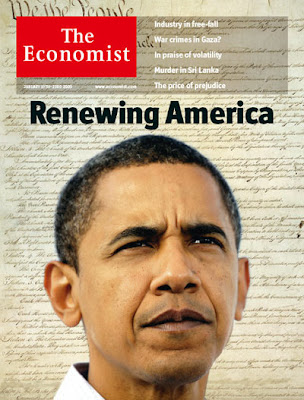
It just seems as if Obama is placed WAY too low, and the shot is cropped at an awkward place at the neck. They couldn't have tightened up that layout a bit? Why are the featured topics double spaced? Why isn't the title of the magazine just a bit higher, so they could scoot Obama up a bit? Unfortunately, this image is without the barcode and price listings (I'm pretty sure that's what they are) that are on all of the newsstand copies, so you're missing out on what really bugged me. So, imagine what it what look like, looking at the placement of the text below Georgie's hand, if all of that text was on top of the President Elect's freaking chin:

And not only that, but the text was much higher up than it is on this cover.
They either need a shot of Obama that isn't as tightly cropped or they need to tighten up other aspects of their layout.
I'm a snob. Sue me.

There is an old series of Snapple commercials of some lady barely peeking over a countertop as she tries to describe Snapple's deliciousness. That commercial always bugged the shit out of me (almost to the point of sweaty nightmares), and this budget cover reminds me of exactly that.
ReplyDelete